Contacts
Things are coming together nicely. But, we still hard coded contacts into the Job Application form. Let’s make this dynamic.
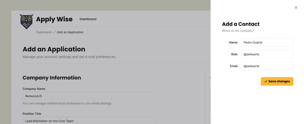
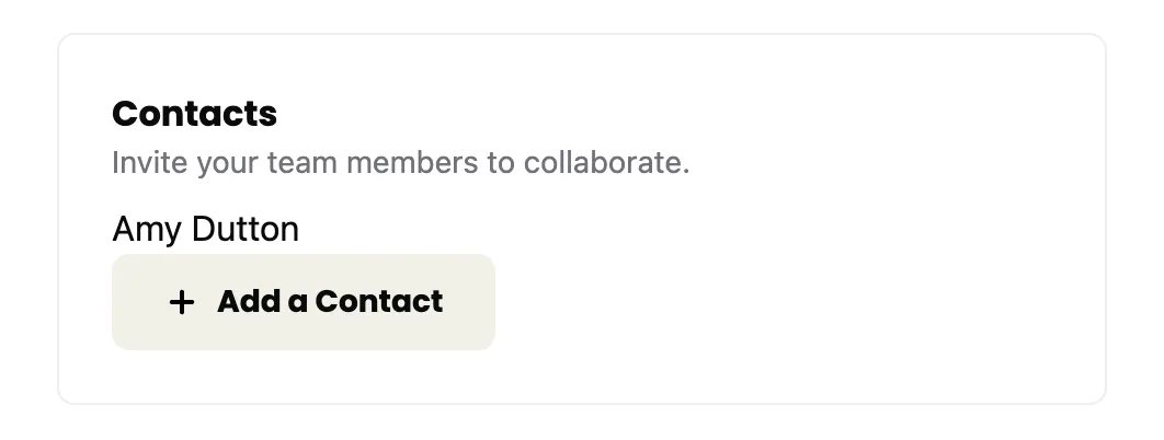
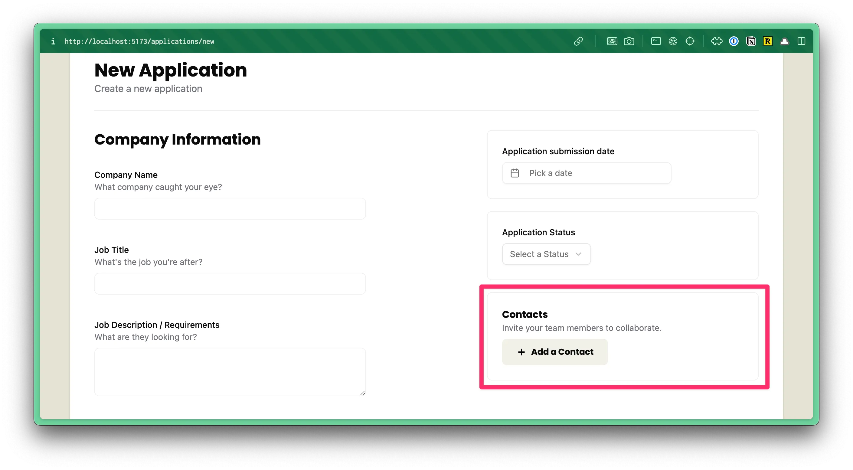
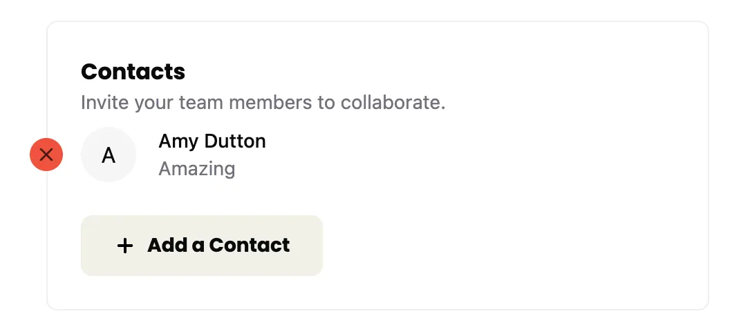
If we look at the Figma file, you’ll notice that we have a “Add a Contact” button on our sidebar:
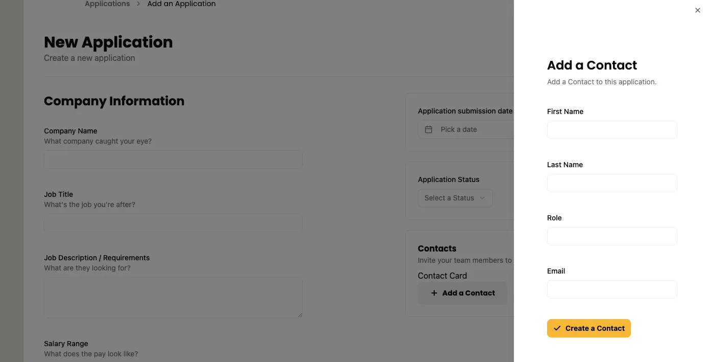
When the user clicks on this button, we want to open a side panel that contains the contact form:
Let’s start with the UI and then we can connect it the database.
Adding a Contact
Styling the Contact Form
Again, shadcn/ui components are great for this.
This time, we’re going to reach for the Sheet component.
You can copy the boilerplate code from the shadcn/ui docs and paste it at the top of our ApplicationForm component:
"use client";
import { Sheet, SheetContent, SheetDescription, SheetHeader, SheetTitle, SheetTrigger,} from "@/app/components/ui/sheet"Then, for our side bar:
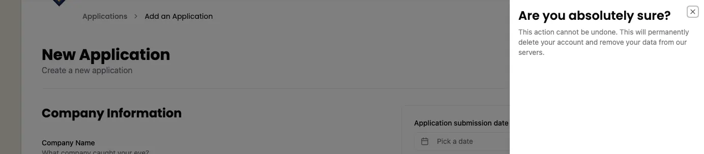
<Sheet> <SheetTrigger>Open</SheetTrigger> <SheetContent> <SheetHeader> <SheetTitle>Are you absolutely sure?</SheetTitle> <SheetDescription> This action cannot be undone. This will permanently delete your account and remove your data from our servers. </SheetDescription> </SheetHeader> </SheetContent></Sheet>This code will go below our <div>Contact Card</div> placeholder:
<div className="box"> <h3>Contacts</h3> <p className="input-description">Invite your team members to collaborate.</p> <div> Contact Card </div> <Sheet> <SheetTrigger>Open</SheetTrigger> <SheetContent> <SheetHeader> <SheetTitle>Are you absolutely sure?</SheetTitle> <SheetDescription> This action cannot be undone. This will permanently delete your account and remove your data from our servers. </SheetDescription> </SheetHeader> </SheetContent> </Sheet></div>If you take a look at this within the browser, you should see the “Open” trigger:
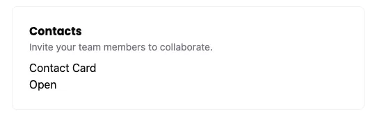
If you click on the trigger, the sheet should slide open:
Now, let’s replace the placeholder content with the real stuff.
You may have noticed that the Sheet code contains, a trigger, SheetTrigger and SheetContent. Inside, the content, there’s a SheetHeader with a SheetTitle and SheetDescription.
First, let’s adjust the SheetTrigger:
<SheetTrigger className="flex items-center gap-2 font-poppins text-sm font-bold bg-secondary py-3 px-6 rounded-md cursor-pointer"> <Icon id="plus" size={16} />Add a Contact</SheetTrigger>- I added an
Iconcomponent and gave it anidofplusand a size of16. - I changed the text to
Add a Contact. - We can add some styling to the
SheetTriggerto make it look like a button.flex items-center gap-2will align the icon and text next to each other, putting8pxof space between them.font-display font-bold text-smwill use the font-familyPoppins, make it bold, and set the font size to14px.bg-secondarywill make the background a beige color (defined in our@theme)py-3 px-6will add12pxof padding to the top and bottom, and24pxof padding to the left and right.rounded-mdwill round the corners of the button.cursor-pointerwill change the cursor to a pointer when hovering over the button.
You’ll also need to import the Icon component at the top of our file:
import { Icon } from "./Icon";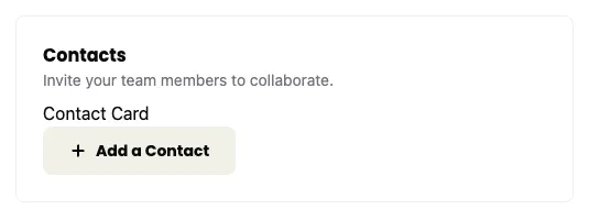
Much better! Then, for our SheetContent:
<SheetContent className="pt-[100px] px-12"> <SheetHeader> <SheetTitle>Add a Contact</SheetTitle> <SheetDescription> Add a Contact to this application. </SheetDescription> <ContactForm /> </SheetHeader></SheetContent>- Change the
SheetTitletoAdd a Contact. - Change the
SheetDescriptiontoAdd a Contact to this application. - For the form, I'm referencing the
ContactFormcomponent. (We'll need to create this.) - I added some styling to the
SheetContentto our content some additional space.100pxof padding to the top and48pxof padding to the left and right.
Now, let’s create our ContactForm component. Inside our src/app/components directory, create a new file called ContactForm.tsx.
Directorysrc/
Directoryapp/
Directorycomponents/
- ContactForm.tsx
Then, be sure to import the ContactForm component at the top of our ApplicationForm component:
import { ContactForm } from "./ContactForm";Inside our ContactForm.tsx file, let’s start with a basic component (you should also see your linting error go away):
const ContactForm = () => { return ( <div>ContactForm</div> )}
export { ContactForm }Now let’s replace our <div> with our form. It should contain fields for:
- first name
- last name
- role
return ( <form> <div className="field"> <label htmlFor="firstName">First Name</label> <input type="text" id="firstName" name="firstName" required /> </div> <div className="field"> <label htmlFor="lastName">Last Name</label> <input type="text" id="lastName" name="lastName" required /> </div> <div className="field"> <label htmlFor="role">Role</label> <input type="text" id="role" name="role" required /> </div> <div className="field"> <label htmlFor="email">Email</label> <input type="email" id="email" name="email" required /> </div> <div className="field"> <Button> <Icon id="check" size={24} /> Create a Contact </Button> </div> </form>)- This form should be pretty straightforward. It's mostly vanilla HTML. I wrapped each
labelandinputpairing with adivthat has a class offield. Conveniently, we've already defined these styles within ourstyles.cssfile. - At the bottom of the form, I'm using a shadcn/ui
Buttoncomponent, similar to what we've done before. I have a checkIconinside with the text "Create a Contact". - I've also made every field required, using the HTML
requiredattribute.
At the top of our file, we need to import our Button and Icon components:
import { Icon } from "./Icon"import { Button } from "./ui/button"Now, let’s test this out, again, within the browser. When you click on the “Add a Contact” button, you should see the styled form slide in:
Great! Now, let’s hotwire this together. We’ll follow a similar approach to what we did with the Job Application form.
Adding a Contact to the Database
On the ContactForm component, let’s set an action on the form element:
<form action={handleSubmit}>Now, we need to write the handleSubmit function. We can add this code right above our return statement:
const handleSubmit = async (formData: FormData) => { const result = await createContact(formData); if (result.success) { console.log("Contact created successfully"); } else { console.error("Error creating contact"); }}- This function will take our form data and pass it to the
createContactfunction. - The
createContactfunction is a server action (we still need to write this). Since it's a server action, we can useasyncandawaitto wait for the result. - If the result is successful, we'll log a message to the console.
- If the result is not successful, we'll log an error to the console.
Now, inside our src/app/pages/applications/functions.ts file, let’s create a new function at the very bottom of our file:
export const createContact = async (formData: FormData) => { try { await db.contact.create({ data: { firstName: formData.get("firstName") as string, lastName: formData.get("lastName") as string, email: formData.get("email") as string, role: formData.get("role") as string, }, }) return { success: true, error: null } } catch (error) { console.error(error) return { success: false, error: error as Error } }}- We're exporting our
createContactfunction so we can import it into ourContactFormcomponent. - The function takes a single argument,
formData. - Inside, we have a
try/catchblock. With thetryblock, we make a call to our database andawaitthe result.- We're already importing our
dbat the top of our file. - Since we're working with the
Contacttable, we can reference it withdb.contact. Then, we can invoke thecreatemethod and pass it an object with all of our form data.
- We're already importing our
- Assuming, we were successful, we return an object with
successset totrueanderrorset tonull. - If there's an error, we log it to the console and return an object with
successset tofalseand the error.
Let’s go back to our ContactForm component and import the createContact function at the top of our file:
import { createContact } from "../pages/applications/functions";Let’s test it out! But, before you do, open up your developer tools and go to the console tab. If everything goes through successfully, you should see a success message in the console:
You can also check Prisma Studio (npx prisma studio) to see the new contact in the database:
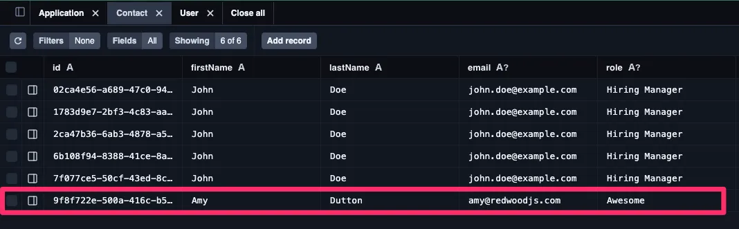
All the John Doe entries are from when we hardcoded the data in.
This works, kind of. — It works, but it’s not the best user experience. It would be better if we could see a success (or error) message in browser.
Fortunate for us, shadcn/ui has a toast component that we can use. This component works a little differently than the other components we’ve used. It has two parts — a Toaster and the Toast:
- The
Toasterhandles where the message is displayed. We can also cue up or show several messages at once. So, theToaster“holds” theToast. - The
Toastertypically lives in a layout component. - Then, child components can send
Toastmessages.
This might make more sense as we build it out.
Within our InteriorLayout component, let’s add the Toaster component:
import { Header } from "../components/Header"import { Toaster } from "@/app/components/ui/sonner"
const InteriorLayout = ({ children }: { children: React.ReactNode}) => { return ( <div className="page-wrapper"> <main className="page bg-white"> <Header /> {children} <Toaster position="top-right" richColors /> </main> </div> )}
export { InteriorLayout }- We’ve imported our Toaster component at the top of our file (notice the import path is
@/app/components/ui/sonner, this is slightly different than the official shadcn/ui documentation) - Then, we added the
Toastercomponent below the{children} - I positioned the
Toasterto the top right of the screen using thepositionprop and appliedrichColors
Even though we already added the sonner.tsx file through the shadcn/ui CLI, we need to make sure that our project knows it’s a client component. At the top of sonner.tsx, let’s add the use client directive:
"use client"Now, on our ContactForm component, let’s import our toast at the top of our file:
import { toast } from "sonner"Then, we can update our conditional statement, inside our handleSubmit function:
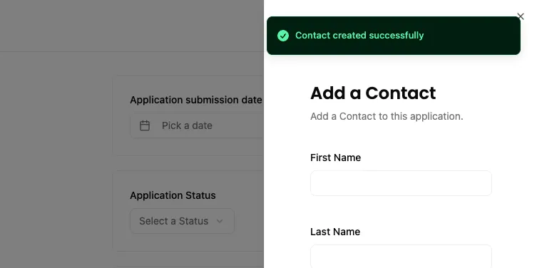
if (result.success) { toast.success("Contact created successfully")} else { toast.error("Error creating contact")}If you test te form again, within the browser, you should see a successful toast message in top right of the screen.
Sweet! Now, we could leave our “Create Contact” form the way it is:
- Click “Add a Contact” button. It triggers the
Sheetcomponent, with ourContactFormnested inside. - Fill out the form and click “Create a Contact”.
- A success message is shown in the browser.
- Our
Sheetcomponent stays open and you can keep adding as many contacts as you’d like. - When you’ve finished adding contacts, you can close the
Sheetcomponent by clicking the “X” in the top right corner.
OR we could close the Sheet component after the form is submitted.
Let’s do that.
Enhancing the User Experience
At first glance, this might seem a little tricky because it doesn’t look like this functionality exists. But, if you click on the “Docs” or “API” button at the top of the Sheet documentation:
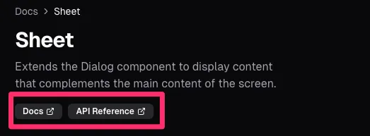
You’ll notice that this component is built on top of the Radix UI Dialog component. There’s a prop called open and onOpenChange that we can leverage.
First, at the top of our ApplicationsForm component, let’s add a piece of state that keeps track of whether the Sheet is open or not:
const [isContactSheetOpen, setIsContactSheetOpen] = useState(false);Then, be sure to import useState at the top of our file:
import { useState } from "react"Now, scroll down to the bottom of the ApplicationForm component, to our Sheet component:
<Sheet open={isContactSheetOpen} onOpenChange={setIsContactSheetOpen}> <SheetTrigger className="flex items-center gap-2 font-display text-sm font-bold bg-secondary py-3 px-6 rounded-md cursor-pointer"> <Icon id="plus" size={16} />Add a Contact </SheetTrigger> <SheetContent className="pt-[100px] px-12"> <SheetHeader> <SheetTitle>Add a Contact</SheetTitle> <SheetDescription> Add a Contact to this application. </SheetDescription> <ContactForm callback={() => setIsContactSheetOpen(false)} /> </SheetHeader> </SheetContent></Sheet>- We'll set
opentoisContactSheetOpen. -- This is the piece of state that keeps track of whether theSheetis open or not. - We'll set
onOpenChangetosetIsContactSheetOpen. -- This updates our state when theSheetis opened or closed. - Then, on our
ContactForm, we'll pass in a callback function. This function will set our state tofalse, closing theSheet.
Now, head over to our ContactForm component and update the handleSubmit function.
.const ContactForm = ({ callback }: { callback: () => void }) => {
  const handleSubmit = async (formData: FormData) => {    const result = await createContact(formData);    if (result.success) {      toast.success("Contact created successfully");
      callback();    } else {      toast.error("Error creating contact");    }  }
If you test everything in the browser, you should still see the successful toast message and the Sheet will close. 😎
Now, we need a way to see the contacts we’ve added.
Displaying Contacts
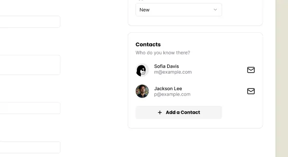
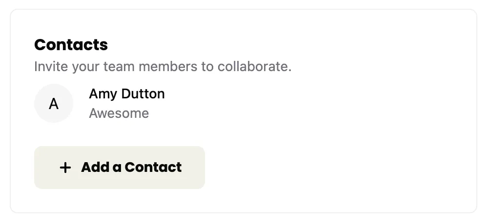
If we look at the design within Figma, we have a list of all the contacts, associated with the job application:
First things first, we need to get a list of all our contacts from the database. We don’t want ALL the contacts, we only want the ones associated with this job application. We haven’t submitted the form yet and any contacts we’ve created so far, aren’t associated with a company. Meaning, we can use the following flow:
- Grab any contacts that aren’t associated with a company.
- When we submit the form, we’ll associate the contact with the company and the job application.
This does create an interesting loop hole. If:
- The user creates some new contacts
- The user doesn’t submit the form and navigates away from the page
- The user comes back to the page, those contacts are still there.
That should be OK, as long as we have a way to remove any contacts in the list. But, we need make sure they’re only seeing contacts they’ve added.
Let’s start by displaying all contacts that aren’t associated with a company.
Getting the Contacts from the Database
Even though our contacts will be displayed in the ApplicationForm component, the ApplicationForm is a client component. It’d be better if we could grab the data inside a server component and then pass it in. (You’ll remember, we did the same thing with our application statuses).
Inside our New page, let’s get all of our contacts, where the companyId is null:
const New = async () => { const statuses = await db.applicationStatus.findMany()
const contacts = await db.contact.findMany({ where: { companyId: null } })
return (Now, we can pass this data into our ApplicationForm component:
<ApplicationsForm statuses={statuses} contacts={contacts} />Inside our ApplicationForm component, let’s add contacts to our list of props:
const ApplicationsForm = ({ statuses, contacts }: { statuses: ApplicationStatus[], contacts: Contact[] }) => {We also need to import the Contact type at the top of our file from @prisma/client. We’re already importing ApplicationStatus from @prisma/client, so simply need to add it our list:
import { ApplicationStatus, Contact } from "@prisma/client"Scroll down to our <div>Contact Card</div> placeholder and replace it with a ul element:
.{contacts && ( <ul>
{contacts.map((contact) => (
<li key={contact.id}> {contact.firstName} {contact.lastName} </li> ))} </ul>)}If you take a look at this within the browser, you’ll see our contact list:
Let’s style our contact card.
Styling the Contact Card
Within the src/app/components directory, create a new file called ContactCard.tsx.
Inside our file, let’s start with a basic component structure:
const ContactCard = () => { return ( <div>ContactCard</div> )}
export { ContactCard }We want to the contact object in as a prop:
import { Contact } from "@prisma/client"
const ContactCard = ({ contact }: { contact: Contact }) => {Then, inside the return statement:
return ( <div> <div> <Avatar> <AvatarFallback> {contact.firstName.charAt(0)} </AvatarFallback> </Avatar> </div> <div> <p>{contact.firstName} {contact.lastName}</p> <p>{contact.role}</p> </div> <div> <a href={`mailto:${contact.email}`}><Icon id="email" size={24} /></a> </div> </div>)Then, at the top the file, import the Avatar and Icon components:
import { Avatar, AvatarFallback } from "./ui/avatar"import { Icon } from "./Icon"Let’s go back through and add some styles:
return ( <div className="flex items-center gap-4 mb-6"> <div> <Avatar className="size-10"> <AvatarFallback> {contact.firstName.charAt(0)} </AvatarFallback> </Avatar> </div> <div className="flex-1"> <p className="text-sm font-medium">{contact.firstName} {contact.lastName}</p> <p className="text-sm text-zinc-500">{contact.role}</p> </div> <div> <a href={`mailto:${contact.email}`}><Icon id="email" size={24} /></a> </div> </div>)- On line 7, we added a class of
flex items-center gap-4to align the avatar, name, and email icon vertically. We also put16pxof space between each element. Then, we also added24pxof margin to the bottom of the card. - On line 9, a class of
size-10makes the avatar40pxwide and40pxtall. - On line 15, the `flex-1 class ensure that the name and role take up as much horizontal space as possible.
- On line 16,
text-sm font-mediumwill make the name14pxand have a font weight of medium. - On line 17, the text role will be
14pxwithtext-smand gray withtext-zinc-500.
Let’s swap out our placeholder content with our component. Inside the ApplicationsForm:
{contacts.map((contact) => ( <li key={contact.id}> <ContactCard contact={contact} /> </li>))}At the top our file:
import { ContactCard } from "./ContactCard"If you take a look at this within the browser, you’ll see our styled contact list:
😍 Lovely!
Now, we need to ensure that the user will only see the contacts that they’ve added.
Limiting the Contacts to the Current User
First, we’ll need to modify our schema.prisma file so that we can keep track of who authored the contact.
model Contact {7 collapsed lines  id        String   @id @default(uuid()) // Contact ID (UUID-based)  firstName String  lastName  String  email     String?  role      String?  companyId String?  company   Company? @relation(fields: [companyId], references: [id])  userId    String  user      User     @relation(fields: [userId], references: [id])4 collapsed lines  createdAt DateTime @default(now())  updatedAt DateTime @updatedAt
  @@index([id])}...model User {3 collapsed lines  id           String        @id @default(uuid()) // User ID (UUID-based)  username     String        @unique  createdAt    DateTime      @default(now())  contacts     Contact[]2 collapsed lines  applications Application[]  credentials  Credential[] // Relationship: One user can have many credentials}
On the Contact model, we need to add a userId column. Then, we need to establish the relationship between the Contact and User models, saying that the user column is a type of User. The relationship is connected through the userId column on the Contact model and references the id column on the User model.
Then, we need to set up the inverse relationship on the User model establishing there are contacts with a type Contact. Since this is an array, we’ll also include square brackets [].
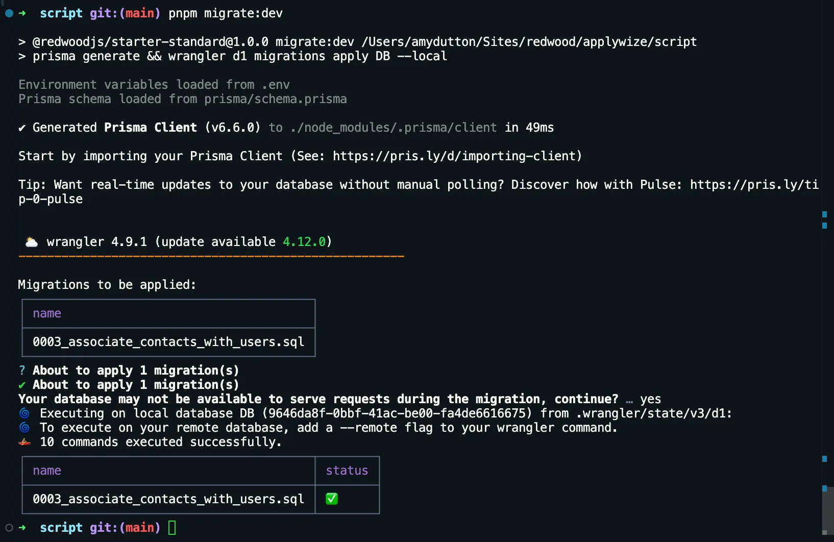
Now, we need to create our migration. Within the terminal:
npm run migrate:new "associate contacts with users"pnpm run migrate:new "associate contacts with users"yarn run migrate:new "associate contacts with users"When you run this, you’ll probably get an error:
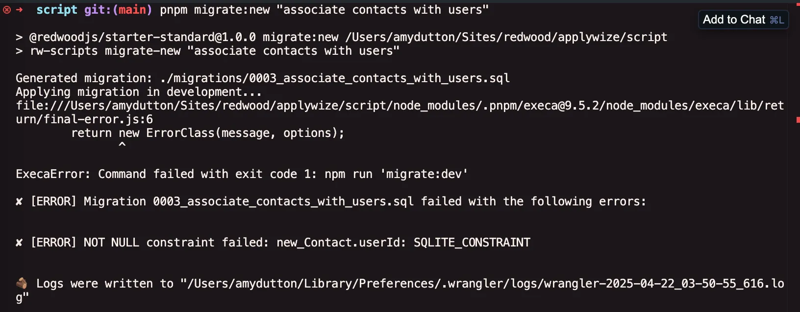
The problem is that we already have contacts in our database. When we added the userId column to the Contact model, we said that it was a required field. This creates a problem for all existing contact entries that don’t have a user associated with them.
If you read the error message, the migration file was created, but not applied.
To fix this, you can try manually removing the existing contacts, or you can run the seed command:
npm run seedpnpm run seedyarn run seedThe seed command will also reset the database because we also clear all the tables at the top of the script:
await db.$executeRawUnsafe(`\ DELETE FROM Application; DELETE FROM ApplicationStatus; DELETE FROM Contact; DELETE FROM Company; DELETE FROM Credential; DELETE FROM User; DELETE FROM sqlite_sequence;`);Now, try running migrate:dev.
The only downside is you’ll need to create a new user account, by visiting http://localhost:5173/user/signup to register.
Then, you can run the application seed command to add a new application, but first, you’ll need to update the user ID within the applicationSeed.ts file:
user: { connect: { id: "c4f35853-8909-4139-98bb-c08663e4230c", },},If you scroll down within the applicationSeed.ts file, you’ll notice there’s an error when creating a contact:
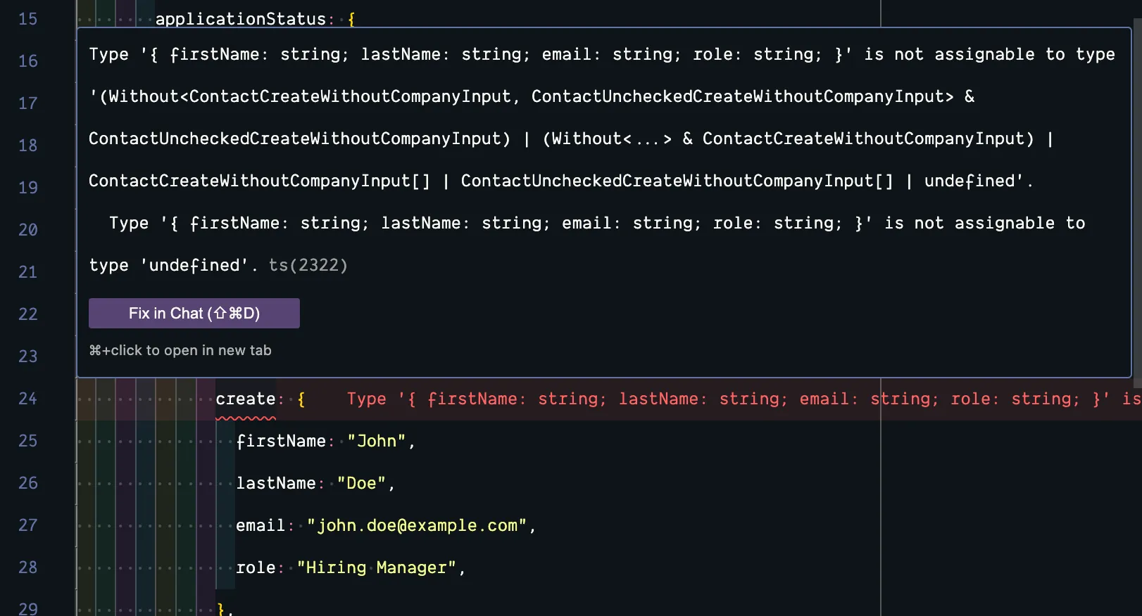
It’s looking for the userId column. This is a quick fix. We can use userId we just updated the application entry with:
contacts: { create: { firstName: "John", lastName: "Doe", email: "john.doe@example.com", role: "Hiring Manager", userId: "c4f35853-8909-4139-98bb-c08663e4230c" },},Now, you can run:
npm run seed:applicationpnpm run seed:applicationyarn run seed:applicationWe also need to update our createContact function, inside our functions.ts file, to include the userId column:
export const createContact = async (formData: FormData) => { try { const { ctx } = requestInfo;
if (!ctx.user) { throw new Error("User not found"); }
await db.contact.create({ data: {4 collapsed lines
firstName: formData.get("firstName") as string, lastName: formData.get("lastName") as string, email: formData.get("email") as string, role: formData.get("role") as string, user: { connect: { id: ctx.user?.id || "", }, }, }, })- In order to get the current user ID, we can get the
ctxfrom therequestInfoobject (line 58). (We already importedrequestInfofor thecreateApplicationfunction.) - On lines 60-62, we can check to see if the
ctx.userexists. If not, we'll throw an error. - If it does, we can connect the
contactto theuserusing theconnectmethod (lines 70-73)
Now, we need to update our database query on the New page.
import { RequestInfo } from "rwsdk/worker";
const New = async ({ ctx }: { ctx: RequestInfo }) => { const statuses = await db.applicationStatus.findMany()
const contacts = await db.contact.findMany({ where: { companyId: null, userId: ctx.user?.id || "" } })- On each page, we have access to the
ctxobject. This has a type ofRequestInfo, defined inrwsdk/worker. - From
ctx, we can access theuserobject and the user's ID. - On our database call, we can add another property to our
whereclause, saying that theuserIdshould match the logged in user's ID.
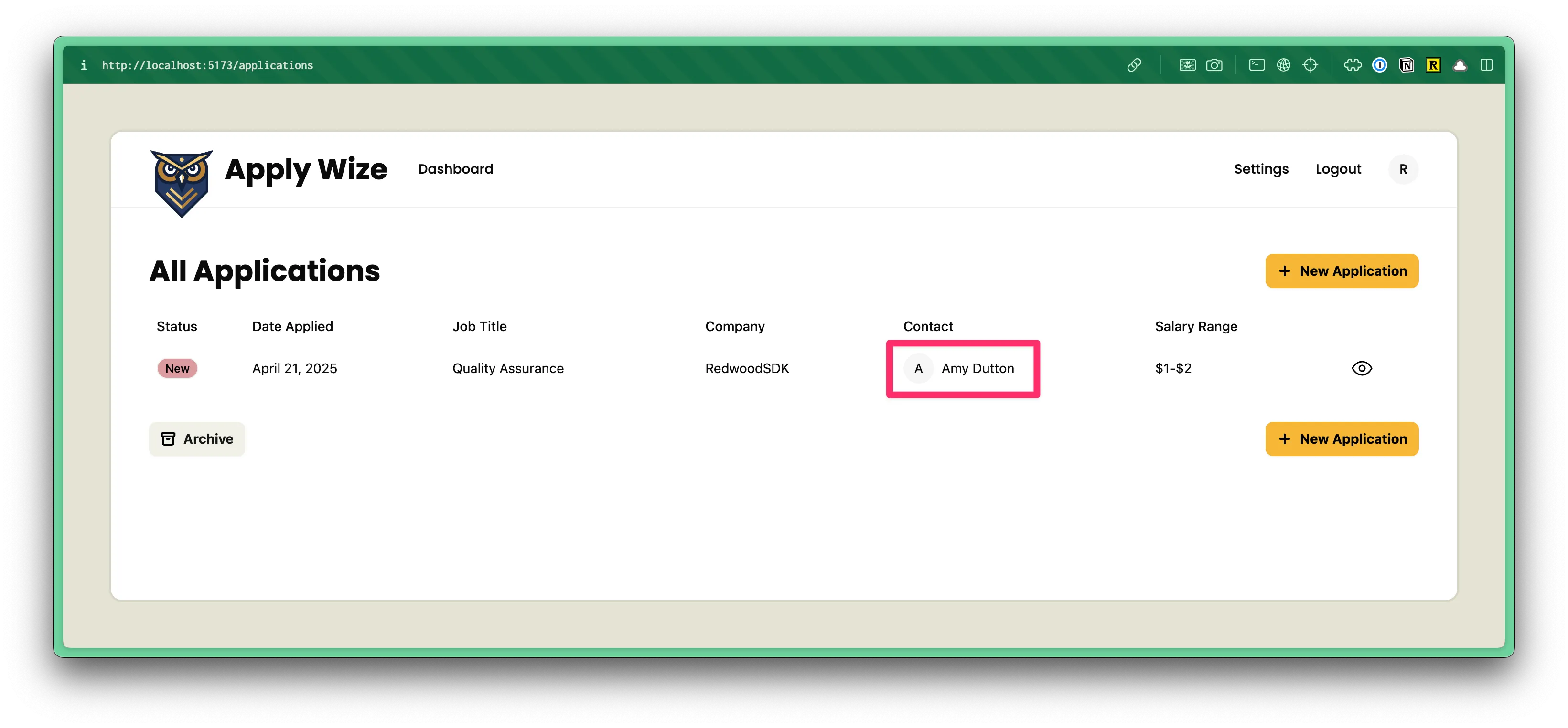
If you try adding contacts using our form, the display will look the same as before. But, you can confirm the new functionality is working by using Prisma Studio to modify a contact’s userId property. If the userId doesn’t match the logged in user’s ID, the contact will not be displayed.
Associating the Contact with a Company
Now, when we add a job application, we need to associate the contact with the company. We’ll need to adjust our createApplication function within the src/app/pages/applications/functions.ts file slightly.
First, let’s ensure that we’re passing our contacts into our createApplication function properly.
Within the ApplicationForm component, go to the handleSubmit function:
const ApplicationForm = ({ statuses, contacts,}: { statuses: ApplicationStatus[]; contacts: Contact[];}) => { const [isContactSheetOpen, setIsContactSheetOpen] = useState(false);
const handleSubmit = async (formData: FormData) => { formData.append("contacts", JSON.stringify(contacts)); const result = await createApplication(formData);- On line 21, we're already passing all of our
contactsinto ourApplicationFormcomponent. - Within our
handleSubmitfunction, we canappendthecontactsto ourformData. The only "catch" is that ourcontactswill need to be converted into a JSON string.
Now, within our src/app/pages/applications/functions.ts file, inside our createApplication function, we need to parse our JSON string:
export const createApplication = async (formData: FormData) => {7 collapsed lines
try { const { ctx } = requestInfo;
if (!ctx.user) { throw new Error("User not found"); }
const contacts = JSON.parse( formData.get("contacts") as string ) as Contact[];- We get the
contactsoff theformDatawhich is a string:formData.get("contacts") as string - Then, we use
JSON.parseto convert the string into an array ofContactobjects.
Be sure to import the Contact type at the top of the file from @prisma/client:
import { Contact } from "@prisma/client"Then, when we’re creating our company, inside the Prisma create method, we can connect our contacts to the company:
company: { create: { name: formData.get("company") as string, contacts: { create: { firstName: "John", lastName: "Doe", email: "john.doe@example.com", role: "Hiring Manager", userId: ctx.user.id, } connect: contacts, }, },},Now, when you create a new job application, any contacts you’ve listed will be associated with the company and job application you created.
And, if you try to add a New Job Application, the contacts list will be empty:
One step remains: removing a contact from the list.
Removing Contacts
Styling the Delete Button
First, we need to modify the ContactCard component to include a delete button:
return ( <div className="flex items-center gap-4 mb-6"> <div> <button role="button"> <Icon id="close" size={16} /> </button> </div> <div> <Avatar className="size-10"> <AvatarFallback> {contact.firstName.charAt(0)} </AvatarFallback> </Avatar> </div>)- On lines 3-7, we added an
Iconcomponent with anidofcloseand a size of16px. Then, we wrapped theiconwith abuttonand adiv.
Now, we need to add some styles.
return ( <div className="relative flex items-center gap-4 mb-6"> <div className="absolute top-2 -left-[37px]"> <button role="button" className="rounded-full bg-destructive p-1"> <Icon id="close" size={16} /> </button> </div>- On line 8, I'm using the wrapping
divto position thebuttonabsolutely. It will appear8pxfrom the top and-37pxover from the left. In order for it to be positioned, relative to the parent container, we need to set thedivtorelativeon line 7. - On line 9, I'm using a regular
buttontag, instead of the shadcn/uiButtoncomponent because this button won't look like any of the other primary action buttons we've created so far.- I have a class of
rounded-fullto turn the button into a circle. bg-destructiveto make the background color red.p-1to add4pxof padding on all sides.
- I have a class of
If you look at this in the browser, you should see our red X next to the contact card:
I think it’d look better if we made the X white. One of my favorite ways to do this is to make the svg fill match the current text color. We can do that by adding a class to our button of text-white and fill-current.
<button role="button" className="text-white fill-current rounded-full bg-destructive p-1"> <Icon id="close" size={16} /></button>Let’s also change the hover color so that the user has some visual feedback when rolling over the button. We can change the background to black and ensure the cursor is a pointer:
<button role="button" className="hover:bg-black cursor-pointer text-white fill-current rounded-full bg-destructive p-1"> <Icon id="close" size={16} /></button>I don’t want a bunch of red circles lined up. If you have a bunch of contact cards, these will be eye catching and distracting from the main form. Let’s make it so that the button only appears when hovering over each respective contact card.
To do this, we’ll need to add a group to the ContactCard component.
<div className="relative group/card flex items-center gap-4 mb-6">On the div wrapping the button:
<div className="hidden group-hover/card:block absolute top-1 -left-[37px]"> <button role="button" className="hover:bg-black cursor-pointer text-white fill-current rounded-full bg-destructive p-1"> <Icon id="close" size={16} /> </button></div>- We can set the
divtohiddenby default. But, when the user hovers over thegroup/cardit applies a display ofblockwithgroup-hover/card:block
Now, if you test this in the browser, you might feel like you’re chasing the button. There’s a gap between the where the div ends and the button begins. We can resolve this by adding some additional padding to the div wrapping the button:
<div className="pr-5 hidden group-hover/card:block pr-10 absolute top-1 -left-[37px]"> <button role="button" className="hover:bg-black cursor-pointer text-white fill-current rounded-full bg-destructive p-1"> <Icon id="close" size={16} /> </button></div>Perfect! With the styling applied, let’s give this button the functionality it needs.
Adding the Delete Functionality
On the button, let’s add an onClick handler:
<button onClick={handleDelete} role="button" className="hover:bg-black cursor-pointer text-white fill-current rounded-full bg-destructive p-1"> <Icon id="close" size={16} /></button>Now that we’ve introduced interactivity, this component needs to be a client component. At the top of the file, let’s add:
"use client"Now, let’s create the handleDelete function that we referenced in the onClick handler. Right above our return statement:
const handleDelete = async () => { const result = await deleteContact(contact.id); if (result.error) { toast.error("Yikes! Couldn't delete."); } else { toast.success("Contact deleted"); }}- Since we're calling a server function, we can use
asyncandawaitto wait for thedeleteContactfunction to complete (we still need to write this function). - We'll pass over the contact's id, so that we know which contact to delete.
- We can store the result in a variable called
result. - If there's an error, we'll display a toast error.
- If it works, we'll display a toast success message.
Now, we need to import toast and deleteContact at the top of our file:
import { toast } from "sonner"import { deleteContact } from "../pages/applications/functions"Now, let’s head over to our functions.ts file and create the deleteContact function.
export const deleteContact = async (contactId: string) => { try { await db.contact.delete({ where: { id: contactId, }, }) return { success: true, error: null } } catch (error) { console.error(error) return { success: false, error: error as Error } }}Hopefully, this workflow is starting to feel familiar.
- On line 82, we're accepting the
contactId, which is a string. - We have a
try/catchblock where we try to delete our contact. If it runs into any problems, it will catch our error (on line 90), console the error, and returnsuccessasfalseand the error itself. - On lines 84-88, we're using the Prisma API to delete the contact, where the
idis equal to thecontactIdthat we passed in.
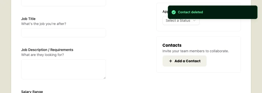
Now, if you try running this in the browser, you’ll probably run into an error:
This is because when the use clicks on the button, the page tries to submit the form. To prevent the default browser behavior, we can update the onClick handler to capture the event:
<button onClick={(e) => handleDelete(e)} role="button" className="hover:bg-black cursor-pointer text-white fill-current rounded-full bg-destructive p-1"> <Icon id="close" size={16} /></button>Now, let’s update the handleDelete function to accept the event and prevent the form from submitting:
const handleDelete = async (e: React.MouseEvent<HTMLButtonElement>) => { e.preventDefault();Now, try running this in the browser again. You should see the contact deleted and a successful toast message:
Lovely!