Jobs Details
Can you believe it?! This is the last piece we need before deploying our application.
We’ve already done the bulk of our set up, so this part should be easy…er? 🙃
First, let’s take a look at what we’re building in Figma.
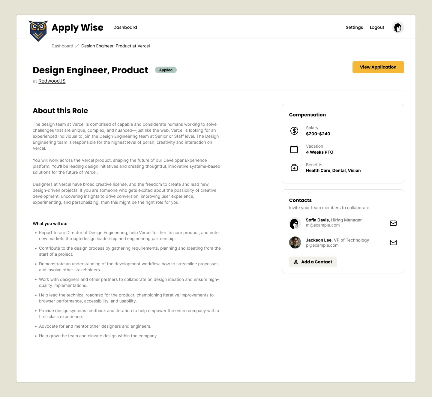
Pretty simple, right?
Styling the Jobs Details Page
Let’s start by creating a new file in our src/app/pages/applications folder called Details.tsx.
Directorysrc
Directoryapp
Directorypages
Directoryapplications
- actions.ts
- Details.tsx
- List.tsx
- New.tsx
We can start with the basics:
const Details = () => { return ( <div>Details</div> )}
export { Details }Now, let’s jump over to our worker.tsx file and update the route for our details page.
 import { Details } from "./app/pages/applications/Details";
render(Document, [4 collapsed lines  index([ isAuthenticated, Home ]),  prefix("/user", userRoutes),  route("/legal/privacy", () => <h1>Privacy Policy</h1>),  route("/legal/terms", () => <h1>Terms of Service</h1>),  prefix("/applications", [    route("/", [isAuthenticated, List]),    route("/new", [isAuthenticated, New]),    route("/:id", [isAuthenticated, () => <h1>Application</h1>]),    route("/:id", [isAuthenticated, () => Details]),  ]),]),
We replaced our placeholder h1 with our Details component and imported it at the top of our file.
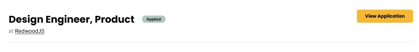
If run go to our Applications list view and click on the eye icon, next to any application, it should take us to the detail page:
Right now, it’s pretty sparse:
Let’s go back to our Details.tsx file and add our InteriorLayout.
return ( <InteriorLayout> <p>Details</p> </InteriorLayout>)Be sure to import InteriorLayout at the top of our file:
import { InteriorLayout } from "@/app/layouts/InteriorLayout"Already, that makes a huge difference:
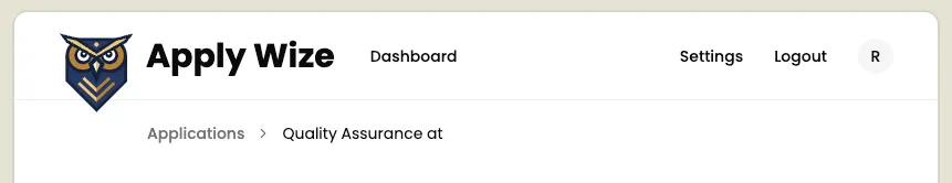
Let’s start at the top of our page and work our way down. Up first, we’ll add our breadcrumbs. We already used the shadcn/ui Breadcrumb component on the New page. Let’s take a second and look at the implementation there:
<div className="mb-12 -mt-7 pl-[120px]"> <Breadcrumb> <BreadcrumbList> <BreadcrumbItem> <BreadcrumbLink href="/applications">Applications</BreadcrumbLink> </BreadcrumbItem> <BreadcrumbSeparator /> <BreadcrumbItem> <BreadcrumbPage>Add an Application</BreadcrumbPage> </BreadcrumbItem> </BreadcrumbList> </Breadcrumb></div>It’s pretty standard, but we have a wrapping div with styles applied for placement. Let’s abstract that out into a CSS class so that we can use it on both pages. In our styles.css file, at the bottom of the @layer components section:
.breadcrumbs { @apply mb-12 -mt-7 pl-[120px];}Now, let’s update the styles on the New page:
<div className="breadcrumbs"> <Breadcrumb> <BreadcrumbList> <BreadcrumbItem> <BreadcrumbLink href="/applications">Applications</BreadcrumbLink> </BreadcrumbItem> <BreadcrumbSeparator /> <BreadcrumbItem> <BreadcrumbPage>Add an Application</BreadcrumbPage> </BreadcrumbItem> </BreadcrumbList> </Breadcrumb></div>Then, let’s copy this code and past it into our Details.tsx file:
return ( <InteriorLayout> <div className="breadcrumbs"> <Breadcrumb> <BreadcrumbList> <BreadcrumbItem> <BreadcrumbLink href="/applications">Applications</BreadcrumbLink> </BreadcrumbItem> <BreadcrumbSeparator /> <BreadcrumbItem> <BreadcrumbPage>Add an Application</BreadcrumbPage> </BreadcrumbItem> </BreadcrumbList> </Breadcrumb> </div> <p>Details</p> </InteriorLayout>)Make sure you import the Breadcrumb component at the top of your file:
import { Breadcrumb, BreadcrumbItem, BreadcrumbLink, BreadcrumbList, BreadcrumbPage, BreadcrumbSeparator,} from "@/app/components/ui/breadcrumb";We need to update the breadcrumb links. The first link is for our Dashboard:
<BreadcrumbItem> <BreadcrumbLink href="/applications">Dashboard</BreadcrumbLink></BreadcrumbItem>The second page should contain the job title and company name.
We need to get that data dynamically, based on the URL, where the application id is being passed in as a parameter.
Getting the Content Based on the URL
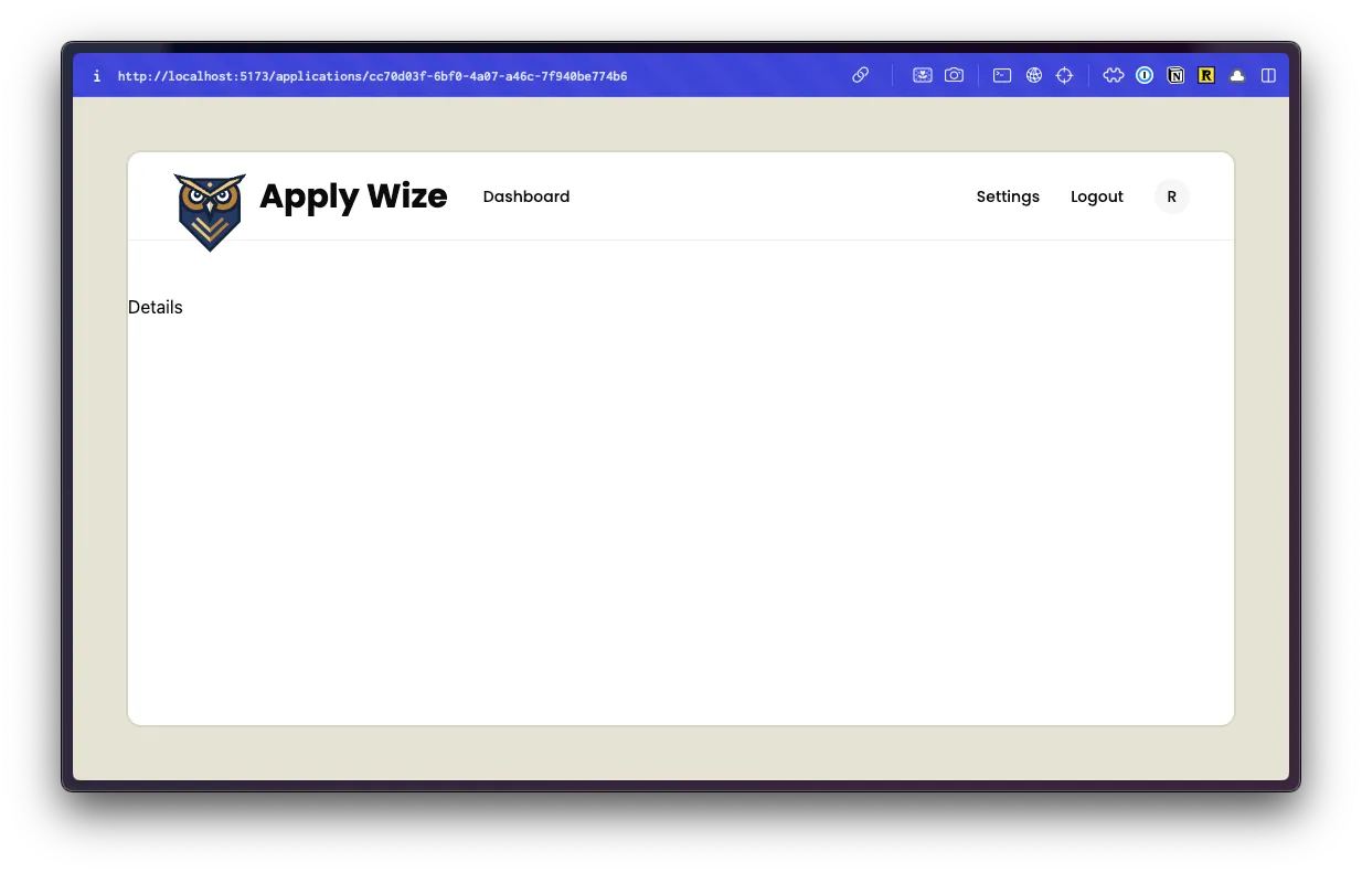
The URL for your page should look something like this: http://localhost:5173/applications/cc70d03f-6bf0-4a07-a46c-7f940be774b6
Everything after applications/ is the application id.
We can get all the details we need based on the RequestInfo object that gets passed into all pages by default.
import { RequestInfo } from "rwsdk/worker"
const Details = async ({ params }: RequestInfo) => {Let’s console.log the params, right before our return statement:
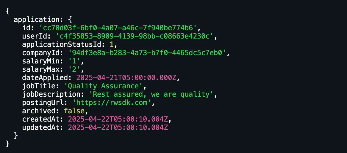
console.log({ params })Since this code is running on the server, this will get logged to the terminal, not the browser.
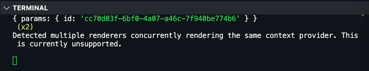
Perfect! We can get the application ID by referencing params.id.
Now, we can remove our console.log({ params }) and make our database call:
import { db } from "@/db"
const Details = async ({ params }: RequestInfo) => { const application = await db.application.findUnique({ where: { id: params.id, }, })
console.log({ application })- We're using the Prisma API to find the unique application by based on its ID. Then, we're logging the result to the terminal.
- Since we're
awaiting the database call, we need to make this functionasync.
If you check the terminal again, you should see the application data:
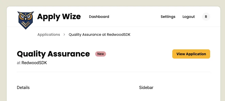
Now, that we know we’re getting the right application back, let’s update our <BreadcrumbPage> to display the job title and company name.
<BreadcrumbPage>Add an Application</BreadcrumbPage><BreadcrumbPage>{application?.jobTitle} at {application?.company?.name}</BreadcrumbPage>We’re using the Elvis operator (?.) or optional chaining to ensure that we don’t throw an error if the application object is null.
When you preview this in the browser, you might be surprised to see that the company information is not showing up.
We need to include the company relationship in our database call:.
const application = await db.application.findUnique({ where: { id: params.id, }, include: { company: true, },})and actually, while we’re here, let’s go ahead and include our status and contact relationships as well. Since the contact relationship is through our company object, we need to go another level deeper:
const application = await db.application.findUnique({ where: { id: params.id, }, include: { status: true, company: { include: { contacts: true, }, }, },})We can get rid of our console.log statement and move down the page.
Building the Page Header
Next, we have a page header:
Below our bread crumbs, let’s start with our JSX and then we can come back and style it.
<header> <div> <h1>{application?.jobTitle}</h1> <Badge variant={ application?.status?.status.toLowerCase() as VariantProps< typeof badgeVariants >["variant"] } > {application?.status?.status} </Badge> <p>at {application?.company?.name}</p> </div> <div> <Button asChild> <a href={application?.postingUrl as string} target="_blank"> View Application <Icon id="external-link" size={16} /> </a> </Button> </div></header>- We're using a semantic
headerHTML tag. - Inside, we have 2
divs to separate the content that will appear on the left and right side. - On the left side
- We have an
h1for our job title. - A
Badgethat contains our application status. Similar to what we did on theApplicationTable, we're using the shadcn/uiBadgecomponent. The "tricky" part is the button variant types. We can use the application status to get the name of the type:application?.status?.status.toLowerCase()but we have to cast it to the correct type:VariantProps<typeof badgeVariants>['variant']. If you'll rememberVariantPropsis a utility that we're getting from thecvalibrary that shadcn/ui uses under the hood. - A
ptag that contains the company name.
- We have an
- On the right side, we have a
Buttonthat contains a link to the application posting URL. Inside, we have a label View Application and anIconcomponent with anidofexternal-linkand a size of16px. The icon will help communicate that this is an external link. - On our
Buttoncomponent, we have anasChildprop that allows ourButtonto render as anatag.
At the top of our file, we need to add a few imports:
import { Badge, badgeVariants } from "@/app/components/ui/badge"import { Button } from "@/app/components/ui/button"import { VariantProps } from "class-variance-authority"import { Icon } from "@/app/components/Icon";Now, let’s do another pass, this time adding our styles.
<header className="flex justify-between border-b-1 border-border pb-6 mb-12">- We can position the items on the left and right side with
flex justify-between. - Then, we can add a
1pxborder to the bottom withborder-b-1and give it a light gray color withborder-border. - We also add some padding (
24pxon the bottom withpb-6and48pxof margin on the bottom withmb-12).
I want the heading and the badge to appear next to each other, so I’ll wrap those elements with an additional div.
<div> <div className="flex items-center gap-5 mb-1"> <h1 className="page-title">{application?.jobTitle}</h1> <Badge variant={ application?.status?.status.toLowerCase() as VariantProps< typeof badgeVariants >["variant"] } > {application?.status?.status} </Badge> </div> <p> <span className="text-zinc-500">at</span>{" "} {application?.company?.name} </p></div>- On line 51, I'll use
flex items-center gap-5to center the heading and badge vertically and add20pxof space between them. Then, I'll add some8pxof space to the bottom withmb-1. - On line 52 we can apply the
page-titleclass to theh1. - Then, let's wrap "at" with a
spanand give it a lighter gray color withtext-zinc-500.
For the button on the right, we need to add some styles to get the icon and label to align vertically:
<Button> <a href={application?.postingUrl as string} target="_blank" className="flex items-center gap-2" > View Application <Icon id="external-link" size={16} /> </a></Button>flexanditems-centerwill center the icon and text vertically.gap-2will add8pxof space between the icon and text.
I want to add some space to the left and right side. But, this will also need to be applied to the content below our page heading. So, let’s wrap, both, our page header and the placeholder <p>Details</p> with a div and add our px-page-side class.
<div className="px-page-side"> <header className="flex justify-between border-b-1 border-border pb-6 mb-12">10 collapsed lines
<div> <div className="flex items-center gap-5 mb-1"> <h1 className="page-title">{application?.jobTitle}</h1> <Badge variant={application?.status?.status.toLowerCase() as VariantProps<typeof badgeVariants>['variant']}>{application?.status?.status}</Badge> </div> <p><span className="text-zinc-500">at</span> {application?.company?.name}</p> </div> <div> <Button><a href={application?.postingUrl as string} target="_blank">View Application</a></Button> </div> </header>
<p>Details</p></div>Build the Main Content Area
Our main content area is a two column grid. This spacing should match the two column grid we set up on our new Application page. We can pull up our ApplicationForm component and abstract those styles into a reusable CSS class:
return ( <form action={handleSubmit}> <div className="grid grid-cols-2 gap-[200px] px-page-side mb-[75px]">I’m going to replace all of our classes, except for px-page-side, with two-column-grid:
return ( <form action={handleSubmit}> <div className="px-page-side two-column-grid">Now, within our CSS file, inside the @layer components section, let’s add our new two-column-grid class:
.two-column-grid { @apply grid grid-cols-2 gap-[200px] mb-[75px]}Back in our Details.tsx file, we can use our new class:
<div className="two-column-grid"> <p>Details</p> <aside> <p>Sidebar</p> </aside></div>Notice, I also added an aside placeholder so that when you preview this within the browser, the two column layout is obvious.
For the content on the left, we can replace the <p>Details</p> with the content from the database:
<div className="two-column-grid"> <p>Details</p> <div> {application?.jobDescription} </div> <aside> <p>Sidebar</p> </aside></div>Now, we want to put a couple of buttons below our content. I’m going to use a couple more divs, one to wrap our job description and another to wrap our buttons.
<div className="two-column-grid"> <div> <div>{application?.jobDescription}</div> <div> <Button variant="secondary"> <Icon id="edit" size={16} /> Edit </Button> <Button variant="link"> <Icon id="trash" size={16} /> Delete </Button> </div> </div> <aside> <p>Sidebar</p> </aside></div>- On line 85 we have our edit button. I'm using the shadcn/ui
Buttoncomponent and applied thesecondaryvariant to give it a beige color. Inside, I'm using ourIconcomponent. I set theidtoeditand the size to16px. - On line 88 we have our delete button. I'm using the shadcn/ui
Buttoncomponent again, bu this time I applied thelinkvariant to remove the background color. There is adestructivevariant, but it turns the background color red and you can only apply one variant at a time. We'll account for the difference through styling. Inside, I'm using ourIconcomponent. I set theidtotrashand the size to16px.
Let’s add some polish through CSS.
<div className="two-column-grid"> <div> <div className="mb-12">{application?.jobDescription}</div> <div className="flex items-center gap-5"> <Button variant="secondary"> <Icon id="edit" size={16} /> Edit </Button> <Button variant="link"> <Icon id="trash" size={16} /> Delete </Button> </div> </div>3 collapsed lines
<aside> <p>Sidebar</p> </aside></div>- On line 83 I added
48pxof margin below our content withmb-12 - On line 84 I adjusted the alignment for the buttons by adding a class of
flex items-center gap-5. This forces this buttons to align vertically and puts20pxof spacing between them. - On line 88 we can make our delete button red by adding a class of
text-destructive. Then, to change the color of our svg to match the text color, we can add a class offill-current.
Excellent! Now, for our sidebar.
We can reuse a lot of the styles that we created for our new application form. Let’s start with the basic JSX:
<aside> <div className="box"> <h3>Compensation</h3> <div> <Icon id="salary" size={32} /> <div> <p>Salary</p> <p> {application?.salaryMin} - {application?.salaryMax} </p> </div> </div> </div></aside>- On line 94, I used the
boxclass we've already created. - We already have some existing styles for
h3s inside of theboxclass. - On line 97 I added an
Iconcomponent with anidofsalaryand a size of32px. - On line 99-102, we have a "Salary" label and a
ptag that contains the salary range. I placed this content in a wrappingdivso that we can eventually align it vertically with the icon.
Let’s go back through and add some more styles:
<aside> <div className="box"> <h3 className="mb-4">Compensation</h3> <div className="flex items-center gap-6"> <Icon id="salary" size={32} /> <div className="text-sm"> <p className="text-zinc-500">Salary</p> <p className="font-bold">{application?.salaryMin} - {application?.salaryMax}</p> </div> </div> </div></aside>- On line 95 I added
16pxof margin below the heading withmb-4 - On line 96, I aligned the icon and salary information with
flex items-center. I also added24pxof padding between withgap-6. - On line 98 I added a class of
text-smto make the salary information14px. - On line 99 I made the text gray with
text-zinc-500. - On line 100 I added a class of
font-boldto the salary range to make it bold.
Now, let’s add the contact box. The only difference between this contact box and the one on the new application form is we don’t need the “Add a Contact” button.
In fact, let’s go over to our ApplicationForm component and copy paste.
<div className="box"> <h3>Contacts</h3> <p className="input-description"> Invite your team members to collaborate. </p> {contacts && ( <ul> {contacts.map((contact) => ( <li key={contact.id}> <ContactCard contact={contact} /> </li> ))} </ul> )}Notice I stopped right before our Sheet component. We won't need it, but when we paste our code, we need to be sure to close our <div> tag.
Now, let’s paste our code into our Details.tsx file.
<div className="box"> <h3>Contacts</h3> <p className="input-description">Invite your team members to collaborate.</p> {contacts && ( <ul> {contacts.map((contact) => ( <li key={contact.id}><ContactCard contact={contact} /></li> ))} </ul> )}</div>At the top of our file, import the ContactCard component:
import { ContactCard } from "@/app/components/ContactCard"On our Contact box, we have some linting errors because it cannot find our contacts.
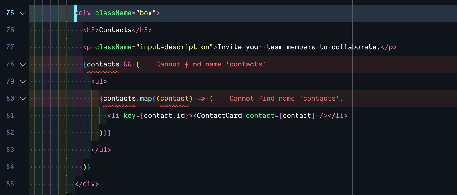
We have this data, but it’s nested inside our application.company object. We can adjust our conditional statement and the object we’re mapping over to get rid of the error:
{application?.company?.contacts && ( <ul> {application?.company?.contacts.map((contact) => ( <li key={contact.id}><ContactCard contact={contact} /></li> ))} </ul>)}Amazing!
The only problem is when you hover over a contact card, the delete button appears.
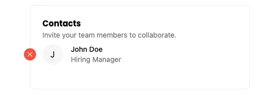
I don’t want to be able to modify the contact information here.
Let’s change the ContactCard component to take a new prop: isEditable.
const ContactCard = ({ contact, isEditable = true,}: { contact: Contact; isEditable?: boolean;}) => {I made the isEditable prop optional and set it to true by default. This way, it won't effect our existing code.
Now, I’m going to wrap our Delete button with a conditional statement that checks if isEditable is true:
{isEditable && ( <div className="pr-5 hidden group-hover/card:block absolute top-2 -left-[37px]"> <button onClick={(e) => handleDelete(e)} role="button" className="hover:bg-black cursor-pointer text-white fill-current rounded-full bg-destructive p-1" > <Icon id="close" size={16} /> </button> </div>)}Back on our Details page, where we’re looping over the ContactCard component, we can pass in false for the isEditable prop:
{application?.company?.contacts && ( <ul> {application?.company?.contacts.map((contact) => ( <li key={contact.id}> <ContactCard contact={contact} isEditable={false} /> </li> ))} </ul>)}If you test this out in the browser, you’ll see that the delete button doesn’t appear when you hover over a contact card on the Details page, but it still appears on the New Application page.
Next up, let’s hot wire the delete button.
Deleting a Job Application
The functionality for the delete button will be similar to how we set up the delete contacts button, but this time let’s use a confirmation dialog or modal window to confirm the user really wants to delete the application.
For this, let’s reach for another shadcn/ui component: the dialog box.
Styling the Dialog Component
Looking at the documentation, the code for this component resembles the Sheet component code:
<Dialog> <DialogTrigger>Open</DialogTrigger> <DialogContent> <DialogHeader> <DialogTitle>Are you absolutely sure?</DialogTitle> <DialogDescription> This action cannot be undone. This will permanently delete your account and remove your data from our servers. </DialogDescription> </DialogHeader> </DialogContent></Dialog>There’s a trigger and a content section, with a nested title and description. If you look at some of the additional examples within the shadcn/ui documentation, you’ll notice we also have access to a <DialogFooter> component, perfect for buttons.
The Dialog component requires button clicks and maintaining state, so we’ll need to be sure we’re using a client component. Since the Details.tsx page is a server component, let’s create a new component specifically for this feature. As an added benefit, we can reuse this component throughout our application.
Inside our src/app/components, let’s create a new file and name it DeleteApplicationButton.tsx
Directorysrc/
Directoryapp/
Directorycomponents/
- DeleteApplicationButton.tsx
Let’s start with a bare bones component:
const DeleteApplicationButton = () => { return ( <div>DeleteApplicationButton</div> )}
export { DeleteApplicationButton }Then, we can replace the placeholder <div>DeleteApplicationButton</div> with the Dialog code from shadcn/ui:
"use client";
import { Dialog, DialogContent, DialogDescription, DialogFooter, DialogHeader, DialogTitle, DialogTrigger,} from "@/app/components/ui/dialog"
const DeleteApplicationButton = () => { return ( <Dialog> <DialogTrigger>Open</DialogTrigger> <DialogContent> <DialogHeader> <DialogTitle>Are you absolutely sure?</DialogTitle> <DialogDescription> This action cannot be undone. This will permanently delete your account and remove your data from our servers. </DialogDescription> </DialogHeader> </DialogContent> </Dialog> )}
export { DeleteApplicationButton }- You'll notice I included the
use clientdirective at the top of our file, as well as our imports. If you copied theimportstatement directly from shadcn/ui, the path will vary slightly.
Before, I forget, we also need to go into our app/components/ui/dialog.tsx component and add a use client directive to the top of our shadcn/ui component as well:
"use client";Back inside our DeleteApplicationButton component, let’s start customizing it, to meet our needs.
Let’s replace Open inside the DialogTrigger component with the Delete button we’ve already styled:
<DialogTrigger> Open <Button variant="link" className="text-destructive fill-current"> <Icon id="trash" size={16} /> Delete </Button></DialogTrigger>You’lll also need to import the Button and Icon components at the top of your file:
import { Button } from "./ui/button";import { Icon } from "./Icon";Before we finish the DeleteApplicationButton functionality. It’s get onto the Details page. Let’s replace the placeholder button with our component:
<Button variant="link"> <Icon id="trash" size={16} /> Delete</Button><DeleteApplicationButton />Of course, we’ll also need to import the DeleteApplicationButton component at the top of our file:
import { DeleteApplicationButton } from "@/app/components/DeleteApplicationButton";If you look at the DOM that’s rendered in the browser, DialogTrigger renders as a button. Then, we have another button nested inside (from the Button component).
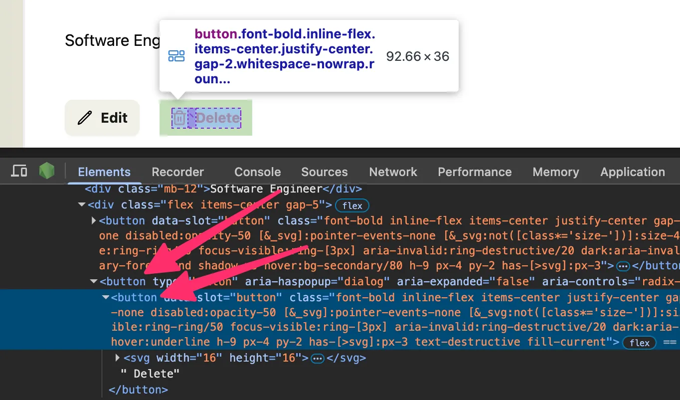
To prevent this from happening, we can use the asChild prop on the DialogTrigger.
<DialogTrigger asChild> <Button variant="link" className="text-destructive fill-current"> <Icon id="trash" size={16} /> Delete </Button></DialogTrigger>Inside the DialogTitle we can use the text: “Are you absolutely sure?”
<DialogTitle>Are you absolutely sure?</DialogTitle>For the DialogDescription, we can use the text: “This will permanently delete the application and any related companies and contacts. This action cannot be undone.”
<DialogDescription> This will permanently delete the application and any related companies and contacts. This action cannot be undone.</DialogDescription>Below the DialogHeader, let’s add a DialogFooter with two buttons: Nevermind and Yes, Delete It.
<DialogFooter> <Button variant="secondary">Nevermind</Button> <Button variant="destructive"> <Icon id="check" /> Yes, Delete It </Button></DialogFooter>- For the "Nevermind" button, I'm using the
secondaryvariant, applying a beige background color. - For the "Yes, Delete It" button, I set the
varianttodestructive. Inside, I added anIconcomponent with anidofcheck.
Let’s go back through and add a little more styling:
<DialogContent className="py-12 px-14"> <DialogHeader className="mb-4"> <DialogTitle className="text-destructive text-3xl font-bold mb-2">Are you absolutely sure?</DialogTitle> <DialogDescription> This will permanently delete the application and any related companies and contacts. This action cannot be undone. </DialogDescription> </DialogHeader> <DialogFooter> <Button variant="secondary">Nevermind</Button> <Button variant="destructive" className="fill-current"> <Icon id="check" /> Yes, Delete It </Button> </DialogFooter></DialogContent>- On line 23, I added
48pxof padding to the top and bottom, withpy-12and56pxto the left and right withpx-14. - On line 24, I added
16pxof margin below the header withmb-4. - On line 25, I made the heading red with
text-destructive,30pxbig withtext-3xl, and added8pxof margin below withmb-2. - On line 32, I added a class of
fill-currentso that the check icon would match the text color of the button.
Now, let’s connect the delete application functionality.
Delete Application Functionality
On our “Yes, Delete It” button, we can add an onClick handler that will call our deleteApplication function.
<Button variant="destructive" className="fill-current" onClick={(e) => handleDelete(e)}> <Icon id="check" /> Yes, Delete It</Button>- We're passing in the
eevent object to thehandleDeletefunction. This will allow us to prevent the default action of the button.
Now, let’s create the handleDelete function, right above the return statement:
const handleDelete = async (e: React.MouseEvent<HTMLButtonElement>) => { e.preventDefault(); const result = await deleteApplication(); if (result.success) { toast.success("Application deleted successfully"); window.location.href = "/applications"; } else { console.error(result.error) toast.error("Failed to delete application"); }}- On line 17, we're using the event (
e) object to prevent the default action of the button. - On line 18, we're calling the
deleteApplicationfunction (we still need to write this function). This is a server function, we can useasync/await. We'll save the result in a variable calledresult. - On line 19, we're checking to see if the result was successful. If it was, we'll display a successful toast message and redirect the user to the applications list page.
- On line 22, otherwise, if we ran into an error, we'll
console.errorthe result and display a toast error message.
At the top of our file, we need to import toast and deleteApplication function:
import { toast } from "sonner";import { deleteApplication } from "@/app/pages/applications/functions";We also need a way of knowing what application we need to delete. We can pass the applicationId into the DeleteApplicationButton component and then on to the deleteApplication function.
const DeleteApplicationButton = ({ applicationId }: { applicationId: string }) => {  const [isOpen, setIsOpen] = useState(false);
  const handleDelete = async (e: React.MouseEvent<HTMLButtonElement>) => {    e.preventDefault();    const result = await deleteApplication(applicationId);
Within our functions.ts file, we need to create the deleteApplication function.
export const deleteApplication = async (applicationId: string) => { try { await db.application.delete({ where: { id: applicationId, }, }); return { success: true, error: null } } catch (error) { console.error(error) return { success: false, error: error as Error } }}- On line 97, we're
exporting thedeleteApplicationfunction so that we can use it in ourDeleteApplicationButtoncomponent. This is anasyncfunction, so we can useawaitto wait for the database call to complete. - We using a
try/catchblock to run the Prisma API call. - On line 99, we're running the calling the
deletemethod,wheretheidmatches theapplicationIdthat we passed in. - If we're successful, we'll return
successastrueanderrorasnull. - If there are any errors, they'll be caught on line 106,
console.errorout. Then, we'll returnsuccessasfalseand include theerrorin the response.
Real quick, let’s go back to the Details page and ensure we’re passing the applicationId into the DeleteApplicationButton component:
<DeleteApplicationButton applicationId={application?.id || ""} />Let’s test this out in the browser.
🙌 Looks like everything is working.
Before we can move on, we need to set up the “Nevermind” button for closing the dialog box.
Closing the Dialog Box
This is a similar problem to the one we ran into with our Sheet component. If you’ll remember, the Sheet component is built on top of the Radix UI Dialog component and this is the Dialog component.
Within our DeleteApplicationButton component, we need to create a piece of state to keep track of whether the dialog box is open or not.
const [isOpen, setIsOpen] = useState(false);You’ll also need to import useState at the top of your file:
import { useState } from "react";Then, we can use the Dialog’s props, open and onOpenChange, to control the dialog box, referencing our state variable. (For more information, check out the official Radix UI documentation for the Dialog component.)
<Dialog open={isOpen} onOpenChange={setIsOpen}>Now, we can update the “Nevermind” button to close the dialog box, by updating the isOpen state:
<Button variant="secondary" onClick={ () => setIsOpen(false) }>Nevermind</Button>If you test this in the browser, the “Nevermind” button should close the dialog box, without deleting the application. 😎
Implementing Edit Functionality
Our application is looking great, but we’re missing one thing: the ability to edit the application.
Setting up the Edit Page and Components
Let’s take the smarter, not harder approach and start with our New application form page and modify it. Let’s duplicate the New.tsx file and name the new file Edit.tsx.
Directorysrc/
Directoryapp/
Directorypages/
Directoryapplications/
- actions.ts
- Details.tsx
- Edit.tsx
- List.tsx
- New.tsx
Inside, we need to rename our component to Edit
const New = async ({ ctx }: RequestInfo) => { const Edit = async ({ ctx }: RequestInfo) => {... export { New } export { Edit }Within our worker.tsx, let’s add the new route:
prefix("/applications", [ route("/", [isAuthenticated, List]), route("/new", [isAuthenticated, New]), route("/:id", [isAuthenticated, Details]), route("/:id/edit", [isAuthenticated, Edit]),]),Be sure to import the Edit component at the top of our worker.tsx file:
import { Edit } from "@/app/pages/applications/Edit";Then, let’s add our new edit page to the list of routes inside our src/app/shared/links.ts file:
export const link = defineLinks([9 collapsed lines
"/", "/user/login", "/user/signup", "/user/logout", "/legal/privacy", "/legal/terms", "/applications", "/applications/new", "/applications/:id", "/applications/:id/edit",]);Now, let’s update the Edit button on the Details page so that we can easily navigate to our new page:
<Button variant="secondary" asChild> <a href={link("/applications/:id/edit", { id: application?.id || "", })} > <Icon id="edit" size={16} /> Edit </a></Button>- I changed the
Buttoncomponent to include theasChildprop. This allows us to maintain the button styles, but render a link instead. - Inside the
Buttoncomponent, I added a link, that uses thelinkfunction to reference theEditpage. The first parameter is the route and the second parameter contains an object with the parameters we're passing in. Here, theapplication?.id
You’ll also need to import the links function at the top of our file:
import { link } from "@/app/shared/links"If you look at this in the browser and click on the Edit button, it should take you to a page that looks like the new application form. But, the URL is different.
Loading the Application from the Database
Let’s get our job application content from the database and pass it into the form:
const Edit = async ({ params, ctx }: RequestInfo) => { const application = await db.application.findUnique({ where: { id: params.id, }, include: { status: true, company: { include: { contacts: true, }, }, }, })- This code is similar to what we're already doing on the
Details.tsxpage. By default, our page gets aRequestInfoobject, which contains theparamsandctx. - We can access the
idin the URL through theparamsobject withparams.id. - On lines 15-27 we're using the Prisma API to find the unique application,
wheretheidis equal toparam.id. - We're also including the
applicationStatus,company, andcontactsin the response, withinclude.
Be sure to import RequestInfo at the top of our file:
import { RequestInfo } from "rwsdk/worker"If we work our way down the file, we still need to grab all the application statuses to populate the dropdown menu:
const statuses = await db.applicationStatus.findMany()But, we can delete the block of code where we get all the contacts that aren’t related to a company:
const contacts = await db.contact.findMany({ where: { companyId: null, userId: ctx.user?.id || "" }})We already have all the contact information we need through the application database call.
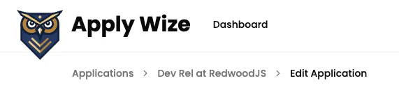
Let’s keep moving down the file. We can change our BreadcrumbPage to display the Job Title:
<BreadcrumbList>4 collapsed lines
<BreadcrumbItem> <BreadcrumbLink href="/applications">Applications</BreadcrumbLink> </BreadcrumbItem> <BreadcrumbItem> <BreadcrumbLink href={link('/applications/:id', { id: application?.id ?? '' })}> {application?.jobTitle} at {application?.company?.name} </BreadcrumbLink> </BreadcrumbItem> <BreadcrumbSeparator /> <BreadcrumbItem> <BreadcrumbPage>Edit Application</BreadcrumbPage> </BreadcrumbItem></BreadcrumbList>- I injected a
BreadcrumbItemand aBreadcrumbSeparatorafter the Applications link to include the job details page. - On the
BreadcrumbLink, I used ourlinkfunction to reference the job details page. - I used the content from our database to dynamically display the job title and company name.
- Then, I changed the
BreadcrumbPagetoEdit Application.
Looking at the next section:
<div className="mx-page-side pb-6 mb-8 border-b-1 border-border"> <h1 className="page-title">New Application</h1> <p className="page-description">Create a new application</p></div>We can change the contents of our page title and description:
<h1 className="page-title">Edit {application?.jobTitle}</h1><p className="page-description">Edit the details of this job application.</p>For the form, I’m going to duplicate the src/app/components/ApplicationsForm.tsx file and name the new file EditApplicationForm.tsx.
Inside, we need to change the name of the component to match the name of the file:
const ApplicationsForm = ({ statuses, contacts }: const EditApplicationForm = ({ statuses, contacts }:... export {ApplicationsForm} export {EditApplicationForm}Then, on the Edit page, let’s swap out the ApplicationsForm component with our EditApplicationForm component:
import { ApplicationsForm } from "@/app/components/ApplicationsForm" import { EditApplicationForm } from "@/app/components/EditApplicationForm"... <ApplicationsForm statuses={statuses} contacts={contacts} /> <EditApplicationForm statuses={statuses} contacts={contacts} />While we’re here, let’s modify the props that we’re passing into our component. We no longer need the contacts prop, but we do need to pass in the application:
<EditApplicationForm statuses={statuses} contacts={contacts} /><EditApplicationForm statuses={statuses} application={application} />Now, let’s move over to our EditApplicationForm.tsx file and update the props, there, to match:
import { ApplicationStatus, Contact } from "@prisma/client" import { ApplicationStatus, Application } from "@prisma/client" import { ApplicationWithRelations } from "../pages/applications/List";... const EditApplicationForm = ({ statuses, contacts }: { statuses: ApplicationStatus[], contacts: Contact[] }) => { const EditApplicationForm = ({ statuses, application, }: { statuses: ApplicationStatus[]; application: ApplicationWithRelations; }) => {We updated the types that we’re importing from Prisma to remove Contact and include Application. Then, we made similar changes to the props that we’re passing into our component.
You’ll notice that we imported ApplicationWithRelations from our List page. This is a type that we created to include the company and contacts details.
Now, et’s work our way through the form, for each input field, we want to set a defaultValue, referencing the application details.
.<input type="text" id="company" name="company" defaultValue={application?.company?.name ?? ''} />
<input type="text" id="jobTitle" name="jobTitle" defaultValue={application?.jobTitle ?? ''} />
<textarea id="jobDescription" name="jobDescription" defaultValue={application?.jobDescription ?? ''} />
<input type="text" id="salaryMin" name="salaryMin" defaultValue={application?.salaryMin ?? ''} />
<input type="text" id="salaryMax" name="salaryMax" defaultValue={application?.salaryMax ?? ''} />
<input type="text" id="postingUrl" name="postingUrl" defaultValue={application?.postingUrl ?? ''} />
Then, for the submit button, change the label from “Create” to “Update”:
<Button role="submit"> Update</Button>Let’s add a second button, to cancel:
<div className="field flex items-center gap-4"> <Button role="submit"> Update </Button> <Button variant="secondary" asChild> <a href={link('/applications/:id', { id: application?.id ?? '' })}>Cancel</a> </Button></div>- On the wrapping
fielddiv, I added a few classes to align the buttons vertically and add16pxof space between them withflex items-center gap-4. - On line 124, I gave the Cancel button a
variantofsecondaryto give it abeigecolor. TheasChildprop allows us to use theatag inside. - On line 125, I used our
linkfunction to reference the job details page and pass in theapplication?.idas theidparameter.
You’ll also need to import the link function at the top of our file:
import { link } from "../shared/links";For the Date Picker, we need to adjust the component slightly. If you try to pass in a defaultValue:
<DatePicker name="dateApplied" defaultValue={application?.dateApplied?.toISOString() ?? ''} />It will show a linting error because it’s not prepared to accept that prop:
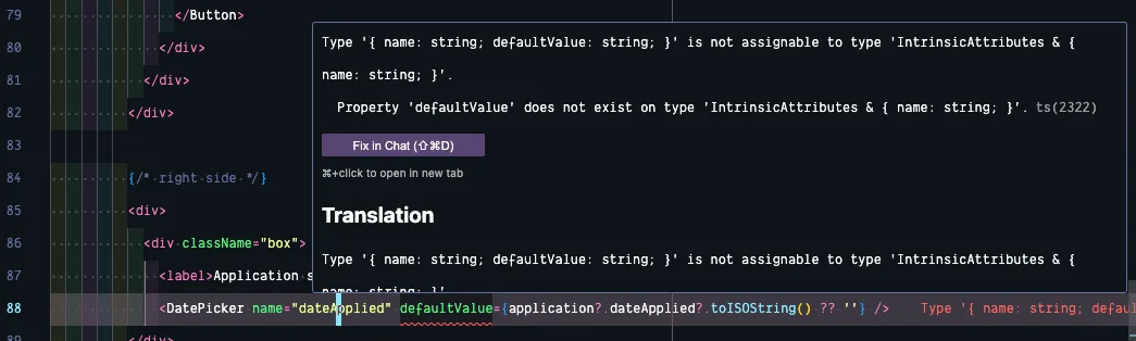
Within the DatePicker component, let’s update the list of props we’re passing in, to include the defaultValue prop:
export function DatePicker({ name, defaultValue = '' }: { name: string, defaultValue?: string }) {- The
defaultValueisn't required, so we used a?to make it optional. - If the
defaultValueisn't passed in,defaultValuewill be an empty string.
We’re already saving the selected date in a piece of state, let’s set the default value of our state to defaultValue we passed in:
const [date, setDate] = React.useState<Date>()const [date, setDate] = React.useState<Date>(defaultValue ? new Date(defaultValue) : new Date())Excellent! Now, let’s go back to our EditApplicationForm.tsx file and update the Application Status. Just like our standard inputs, we can pass in a defaultValue prop:
<Select name="statusId" defaultValue={application?.status?.id.toString() ?? ""}>For the Contacts section, we just need to adjust the contact array its referencing:
{contacts && ( {application?.company?.contacts && ( <ul> {contacts.map((contact) => ( {application?.company?.contacts.map((contact) => ( <li key={contact.id}><ContactCard contact={contact} /></li> ))} </ul>)}If you check out the page within the browser, you should see all our application details loaded in:
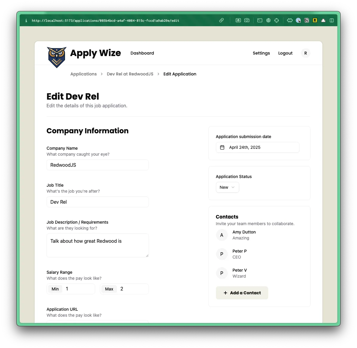
Updating the Application
Now, we just need to handle the form updates.
Let’s start with the contact form. If you’ll remember, we set the contact form up so that when a new contact is created, it’s not assigned to a company. Here, though, we have a company.
Instead of duplicating the ContactForm component, let’s make it “smart” enough to handle both use cases.
Inside our EditApplicationForm component, where we’re using our ContactForm component, let’s pass in the companyId:
<ContactForm callback={() => setIsContactSheetOpen(false)} companyId={application?.company?.id ?? ""}/>Right away, you will see an error because our ContactForm isn’t expecting a companyId prop. Let’s fix that:
const ContactForm = ({ callback, companyId = "",}: { callback: () => void; companyId?: string;}) => {- I set the default value to an empty string:
companyId = '' - I also made the
companyIdprop optional with a question mark? - The beauty in this approach is that it won't break or change our existing implementation on the
Newjob application page.
Inside the handleSubmit function, let’s append the companyId to our formData:
const handleSubmit = async (formData: FormData) => { formData.append("companyId", companyId); const result = await createContact(formData);}Now, let’s jump over to our createContact function, inside our src/app/pages/applications/functions.tsx file and get the companyId from the form data:
export const createContact = async (formData: FormData) => {7 collapsed lines
try { const { ctx } = requestInfo;
if (!ctx.user) { throw new Error("User not found"); }
const companyId = formData.get("companyId") as string;On our database call, we can conditionally connect the company, if the companyId exists:
await db.contact.create({10 collapsed lines
data: { firstName: formData.get("firstName") as string, lastName: formData.get("lastName") as string, email: formData.get("email") as string, role: formData.get("role") as string, user: { connect: { id: ctx.user?.id || "", }, }, ...(companyId ? { company: { connect: { id: companyId, }, } } : {}) },})- On line 74, we're using a spread operator to say if the
companyIdexists, then connect the company to the contact. Otherwise, we'll use an empty object.
You can test this out in the browser, ensuring it works on both the New and Edit pages.
The only remaining task is to update the handleSubmit function on the EditApplicationForm. This is what we currently have.
const handleSubmit = async (formData: FormData) => { formData.append("contacts", JSON.stringify(contacts)); const result = await createApplication(formData); if (result.success) { window.location.href = `/applications`; } else { console.error(result.error); }}We can remove line 26, where we’re appending the contacts to the formData.
Instead of calling createApplication, let’s call updateApplication instead (we still need to write this function):
const handleSubmit = async (formData: FormData) => { const result = await updateApplication(formData);5 collapsed lines
if (result.success) { window.location.href = `/applications`; } else { console.error(result.error); }}Be sure to update the import statement at the top of your file:
import { createApplication } from "@/app/pages/applications/functions"import { updateApplication } from "@/app/pages/applications/functions"Inside our src/app/pages/applications/functions.ts file, let’s write the updateApplication function:
export const updateApplication = async (formData: FormData) => { try { await db.application.update({ where: { id: formData.get("id") as string, }, data: { salaryMin: formData.get("salaryMin") as string, salaryMax: formData.get("salaryMax") as string, jobTitle: formData.get("jobTitle") as string, jobDescription: formData.get("jobDescription") as string, postingUrl: formData.get("url") as string, dateApplied: formData.get("dateApplied") as string, company: { update: { name: formData.get("company") as string, }, }, status: { connect: { id: parseInt(formData.get("statusId") as string), }, }, } })
return { success: true, error: null } } catch (error) { console.error(error) return { success: false, error: error as Error } }}- This is basic
try/catchblock. Wetryand run our database method an if it encounters an error, then we'llcatchit and return an error object. - On line 122 - Our database call is similar to the
createApplicationfunction, but instead ofcreate, we're usingupdate. - On lines 125-127 - We're using a
whereclause to specify which application we want to update. - On lines 135-139 - We're using an
updatemethod to update the company name (instead ofconnect) - On lines 140-144 - We're using the
updatemethod to update the application status (instead ofconnect). - On line 142 - the Application Status ID is a number, but the
statusIdon theformDatais anumber, so we're casting it from a string into a number withparseInt.
This is great, the only problem is that the application id does not exist in our form data.
Let’s go back to our EditApplicationForm and add a hidden input field to our form:
<input type="hidden" id="id" name="id" defaultValue={application?.id ?? ""}/>Perfect! Now test the update form within the browser. You should be able to edit and save changes to our application.
💥 We did it! Now, we just need to get our application online where people can use it!